Moshtix Control Room
OVERVIEW
Redesigned the interface for creating events and managing ticket types, supporting first time users building simple events and expert users regularly building complex events.
ROLE
Product Designer, User Research, Interaction, UI Design, Visual Design, Information Architecture – 2018
BACKGROUND
Moshtix has a client facing and customer facing business model. One platform for the event organiser and one for the event purchaser. Both had only ever seen small additions for many years which led to both platforms being a mostly mix and match affair with no UX design input.
Decisions were primarily led by organiser requests and contractual obligations to clients. This meant both platforms had features added on without any real in depth evidence based decision making.
There were many challenges in this project but the two main issues were:
The development stack was over a decade old which limited the options for implementation of advanced technical solutions
The two platforms – the control room and the ecommerce site – were so closely intertwined that when one changed the other had to change with it
THE PROCESS
This project like all others at Moshtix followed the process of Discovery, Definition, Ideation and Implementation. Moshtix is unique to other ticketing agencies in that it’s highly service orientated approach leads to the staff having an advanced understanding of the product. This essentially meant that our Client Manager’s were a wealth of knowledge for us as they were the users with the most knowledge about what the event promoters and organisers want from a ticketing solution, and what the pitfalls of our the current product and processes were.
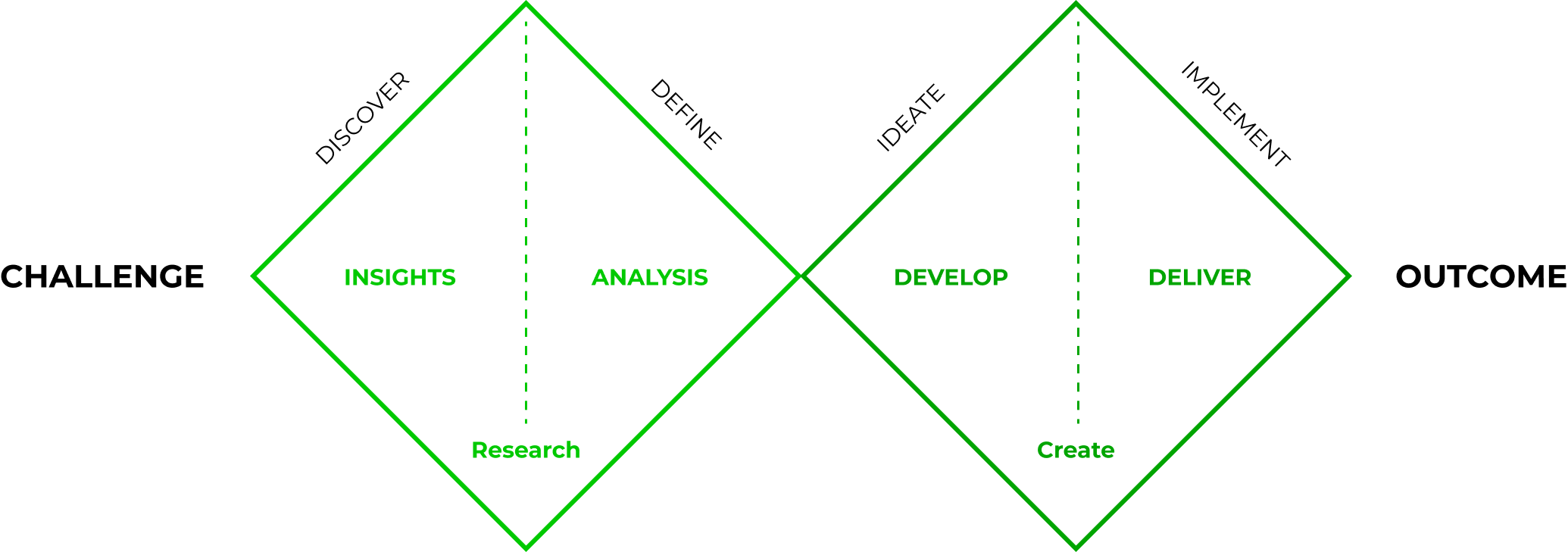
DISCOVERY
For the discovery phase the initial step was to interview and test users from across the country, both in-house and clients, in person and via video. The range of users tested fell into the following categories:
Venue
Festival Owner
Venue Booker
Festival Promoter
Moshtix Client Managers
Interviews and testing unique to each user type were performed on the the existing solution with clients and users.
DEFINING THE FEATURE SET
An analysis was performed on the existing product to define the feature set. This was used down the track to match up against users pain points and goals.
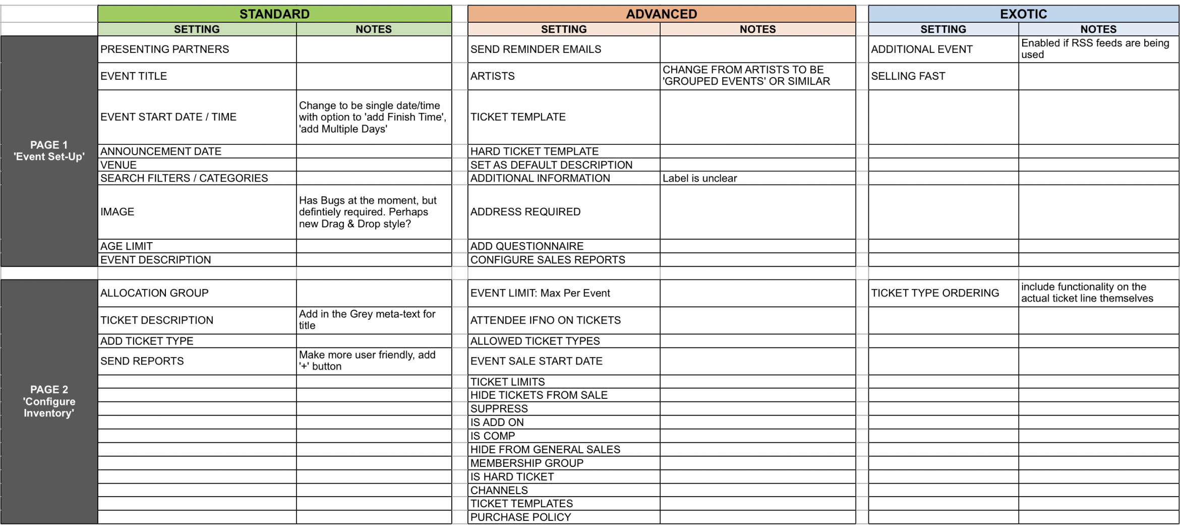
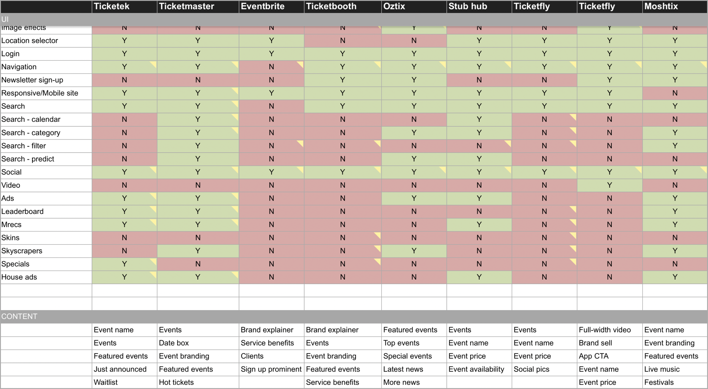
I also performed competitor analysis on all competing ticketing agencies to help inform our feature set at a later stage in the project. Analysis was performed on back and front end products to gather insights on UI elements, content options for marketing and analytics options for tracking of audiences and sales.
GATHERING INSIGHTS
After collecting the data from the user interviews, tests, and competitive analysis, affinity mapping was used to synthesise the pain points and feature set. I performed this task with a teammate, we grouped the data into common themes and goals.
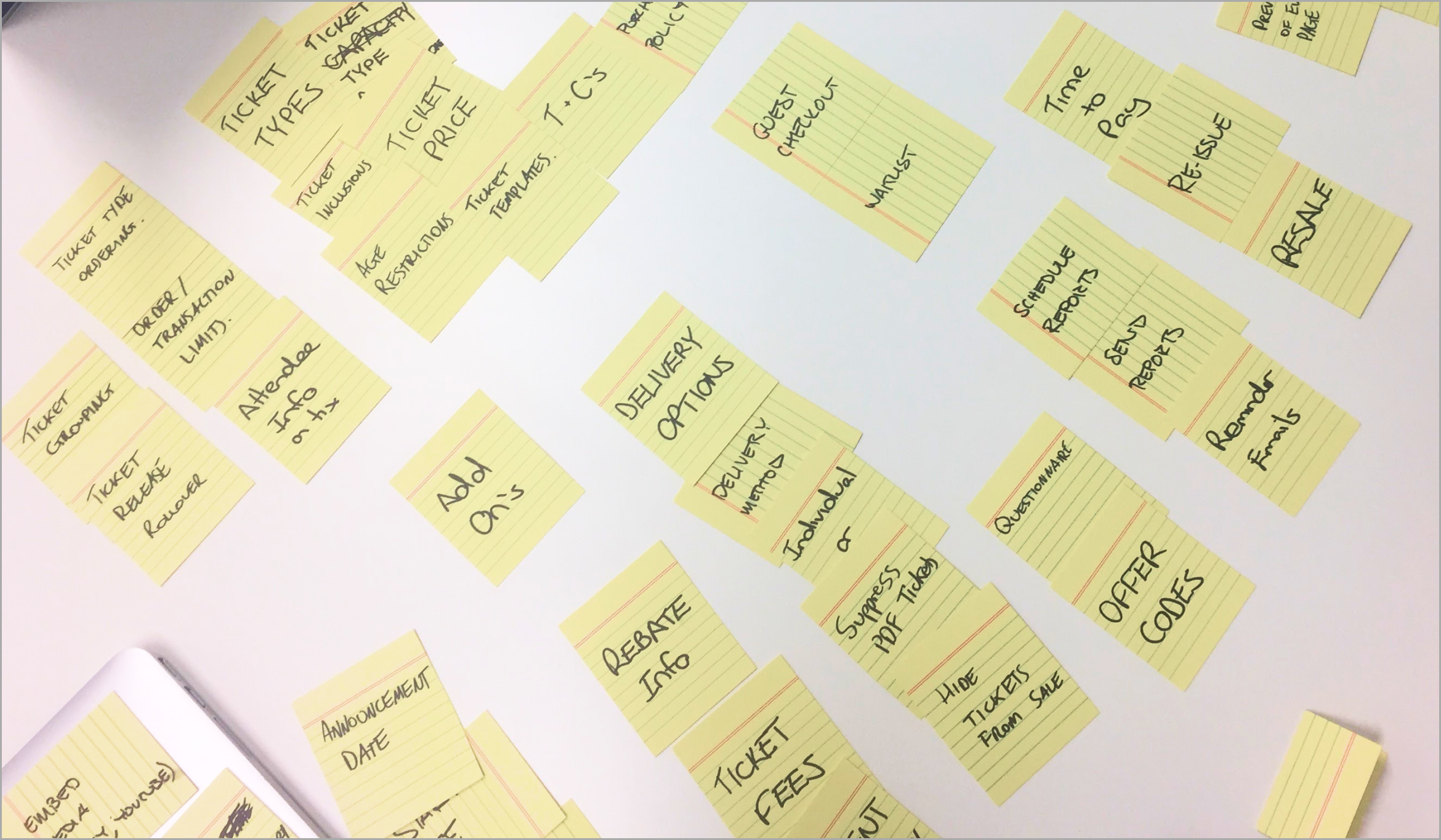
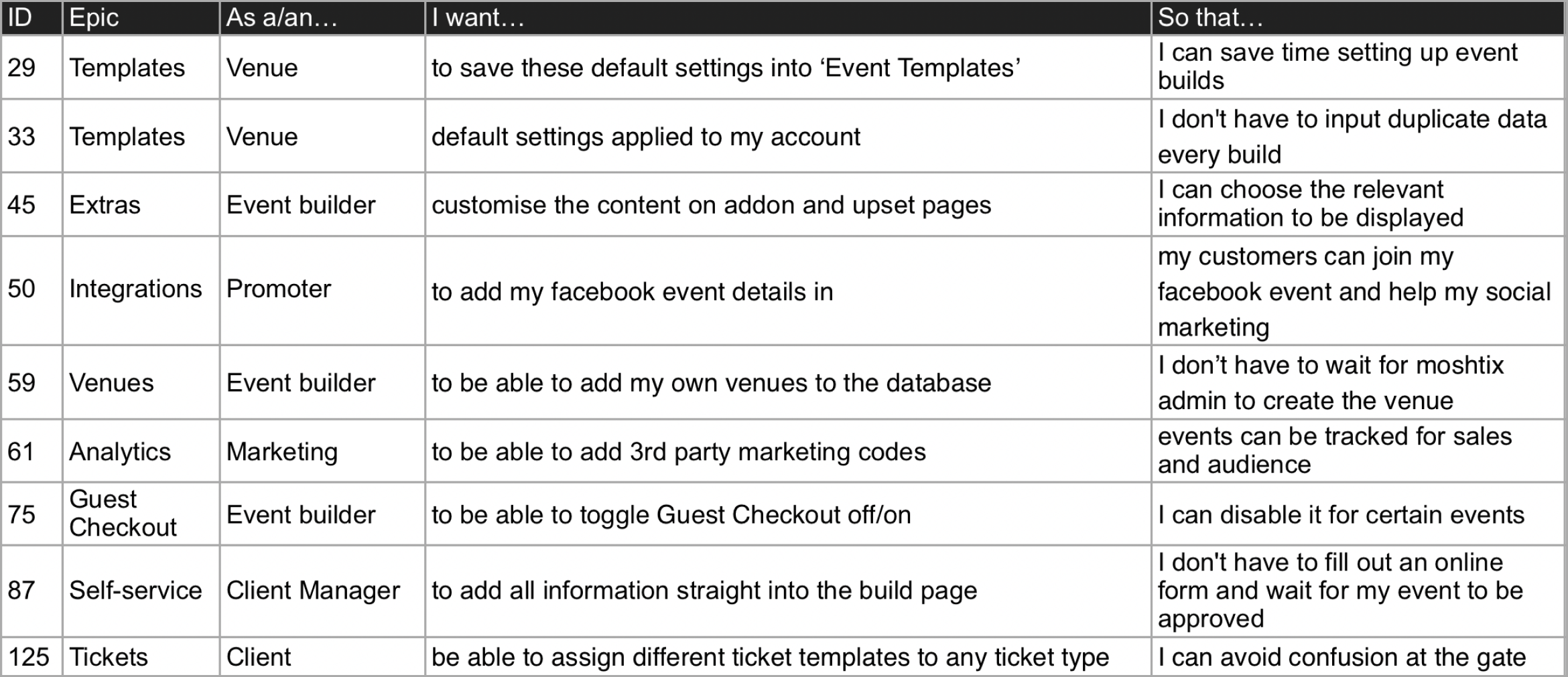
Workshops were then conducted with all parts of the business to develop user stories This took several rounds of workshops were conducted to make sure all features were thoroughly thought through. These were finalised in a final workshop with the heads of all departments:
Client Managers
Design
Finance
Marketing
Operations (Event Day)
Technology
These user stories when combined with the earlier research were used to help define the Epics for the product.
THE PRODUCT VISION
It’s at this stage of the project that the problem statement became clear. What was needed was a self service product for simple events right through to a more advanced product for more complicated, larger events. We needed to compete with the newer players in the market such as Eventbrite, but also service our current client base’s needs and goals for the future landscape of ticketing.
WORKING WITH DEVELOPERS
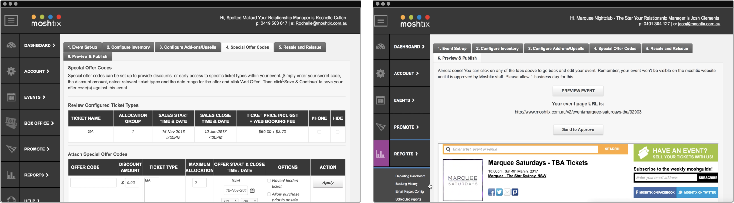
Historically Moshtix had developed product in Microsoft.NET ASP and MVC using Razor view engine in combination with jQuery and plain old HTML/CSS for layout and interactive UI. The existing solution was outdated and there was no consistency across products, release times were impacted significantly due to the amount of work needed to QA and test releases.
For the newer generation of product the Technology team pivoted to React and Emotion (CSS in JS) for front end, and to leverage Apollo GraphQL client to communicate with a Serverless Node.JS GraphQL API. This meant a lot of discussions with developers about their progress on developing the new stack, our limitations and possibilities as well as how to integrate a new component library and design system.
DEFINING THE MVP
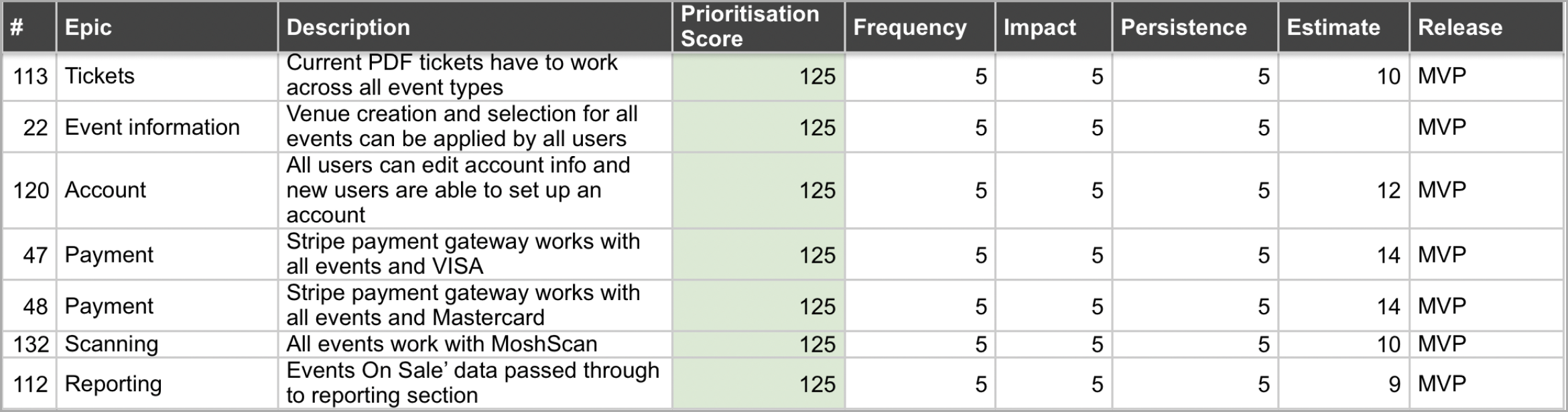
A prioritisation analysis was used to help me identify how many events were using which features and how often they were being used. I primarily used analytics to collect the data on a wide range of our events. The work was also estimated by the each department that needed to be involved in the design, development, testing and deployment of each feature.
This helped to determine the order in which features were developed and which features absolutely needed to make the MVP in order to service the most events possible at launch. It was an essential task to make sure that Moshtix could sell enough tickets to stay afloat and make sure over 90% of events could still be facilitated.
DEVELOPING THE SOLUTION
Once the insights were gathered and the product was defined there was a clear way forward. I set out with the Design team to develop some wireframes for our early concepts.
Given that only parts of the product could be worked on we were hamstrung in a couple of areas. We had to stick with the side navigation for the control room and which meant we also had to use the page by page format for the event build itself.
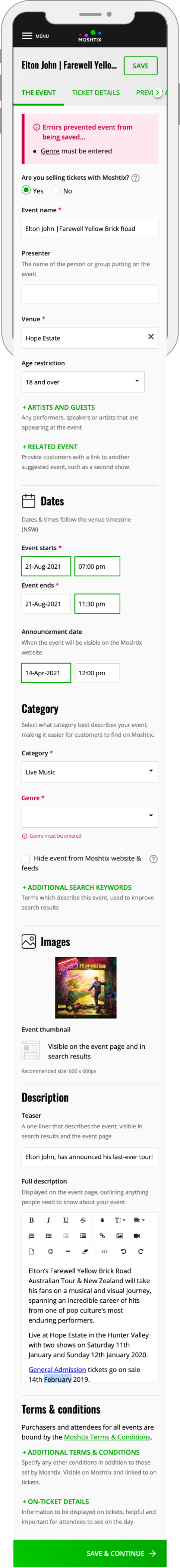
A key component of the research discovered that users mainly built events on a larger screen at their desks or at home but would like the ability to update anything on the fly, should anything change on event day. This led to a focus on getting a feature heavy product right for the desktop but also making sure it was accessible on smaller devices with the same amount of ease.
DEVELOPING THE DESIGNS
Once the wireframes passed usability testing, high-fidelity designs were developed in line with the Moshtix rebrand that had been recently finalised in conjunction with this project.
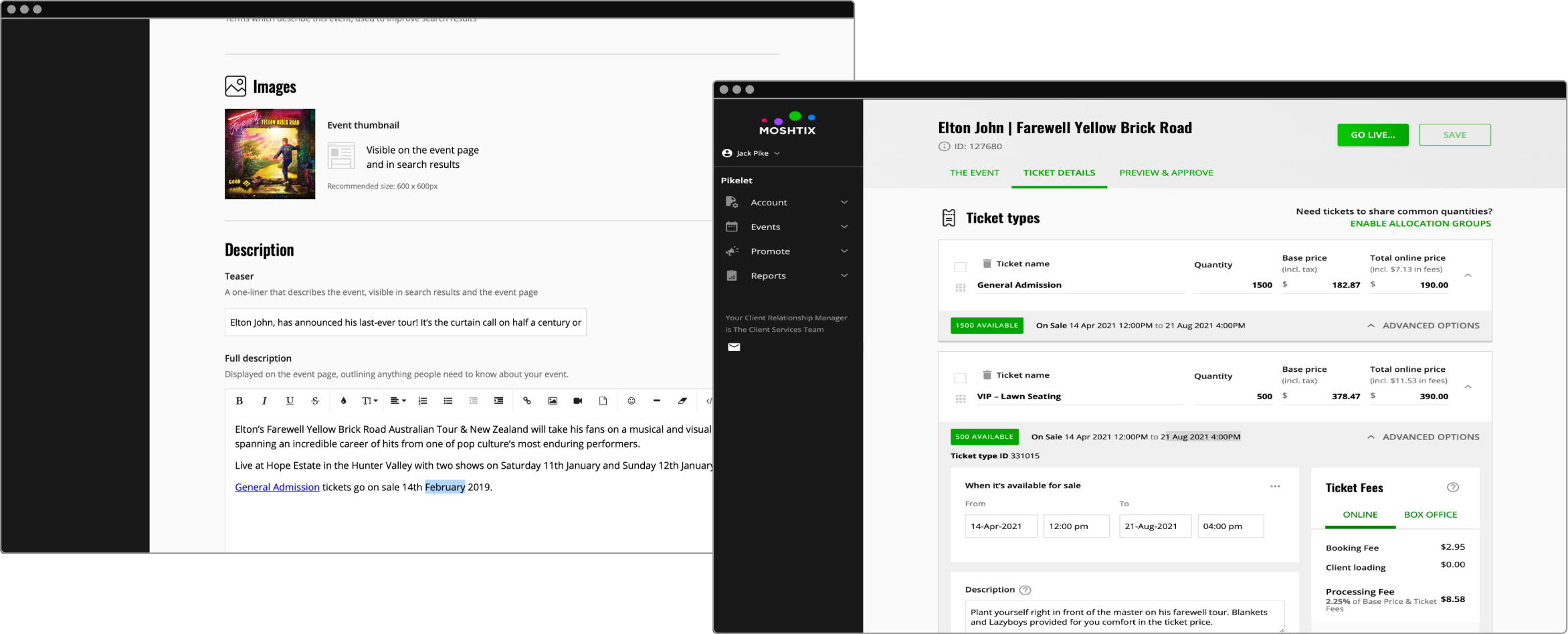
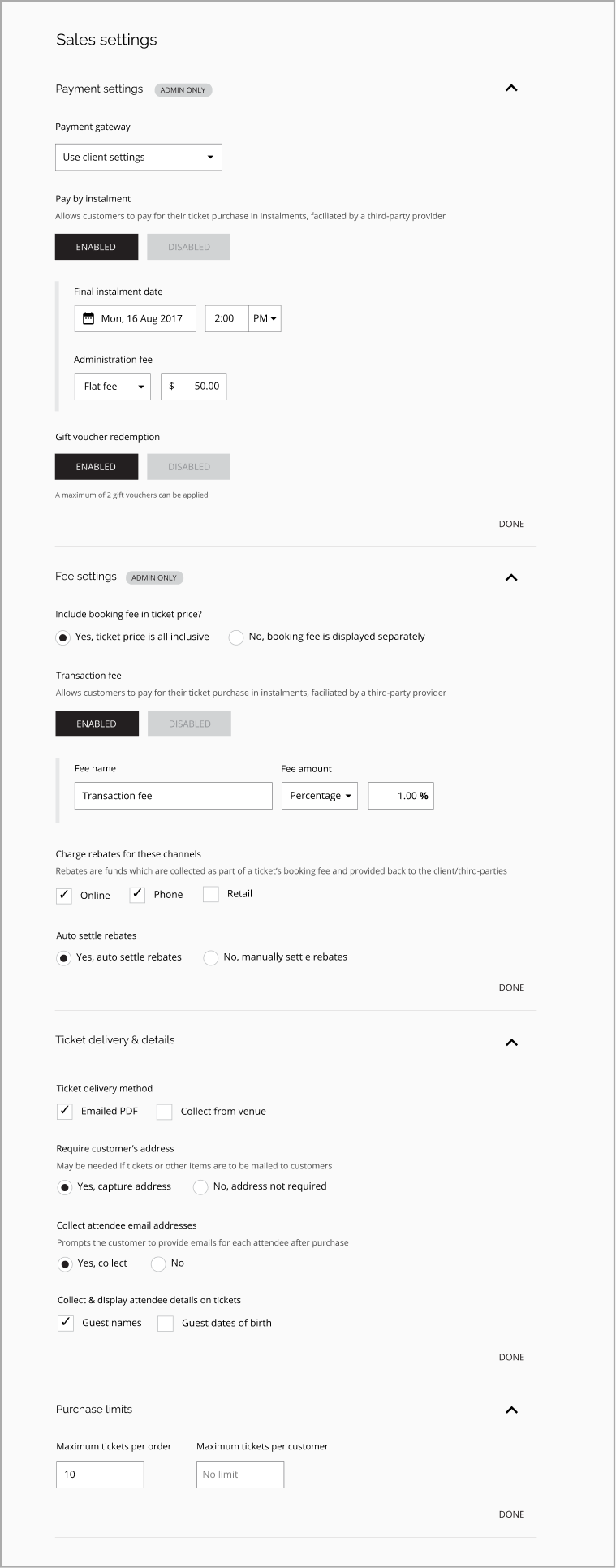
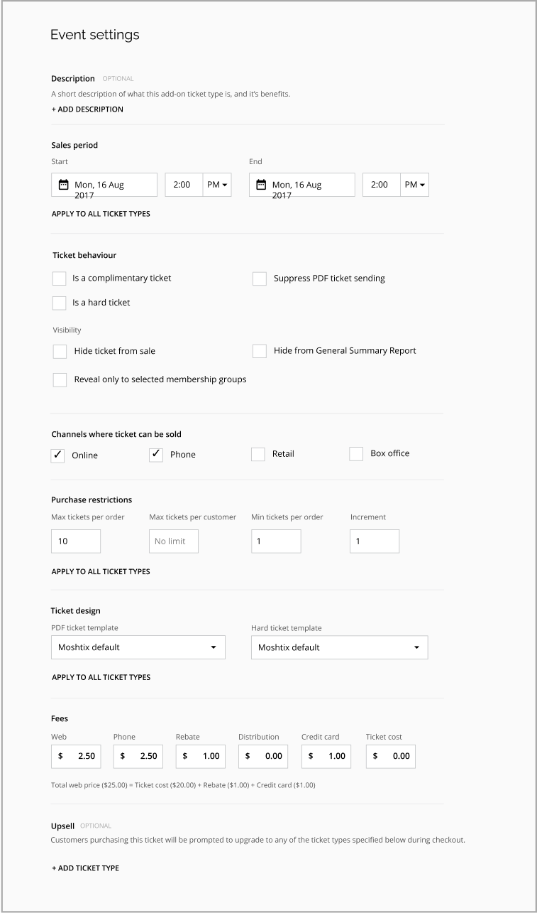
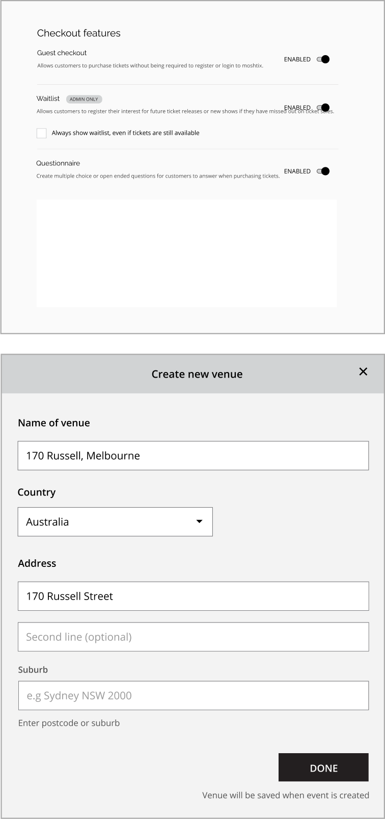
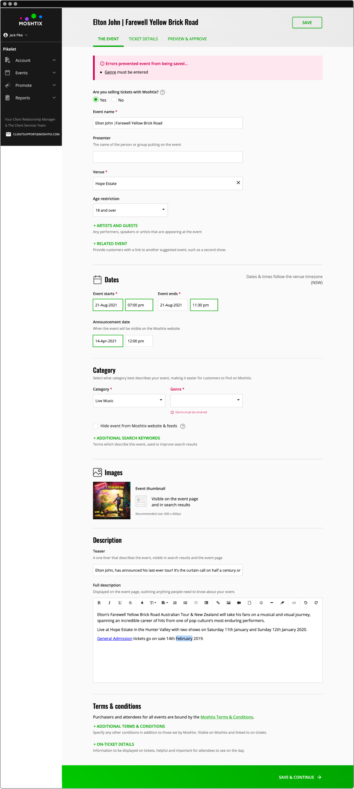
1. Event details with error state
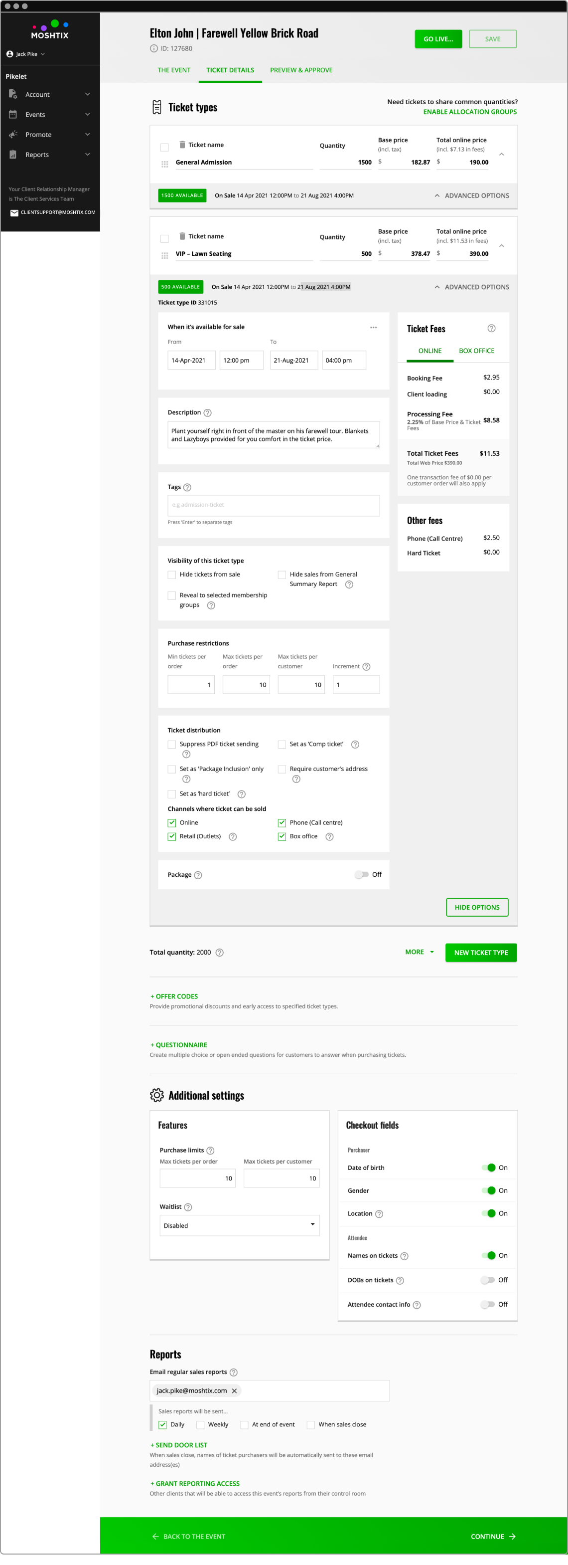
2. Ticket details with advanced options
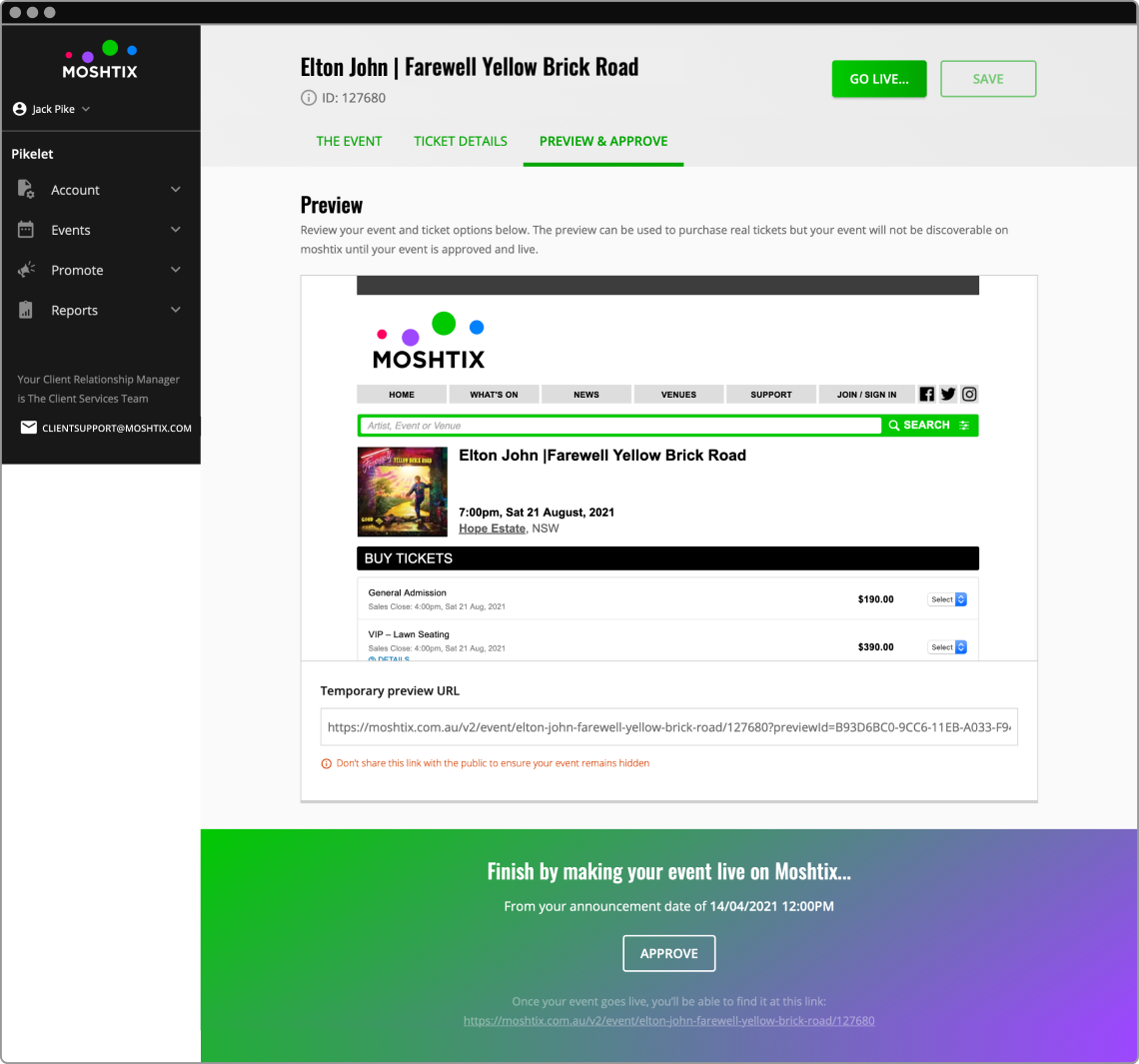
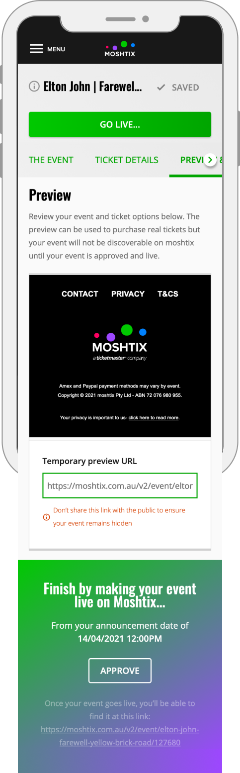
3. Preview and approve event
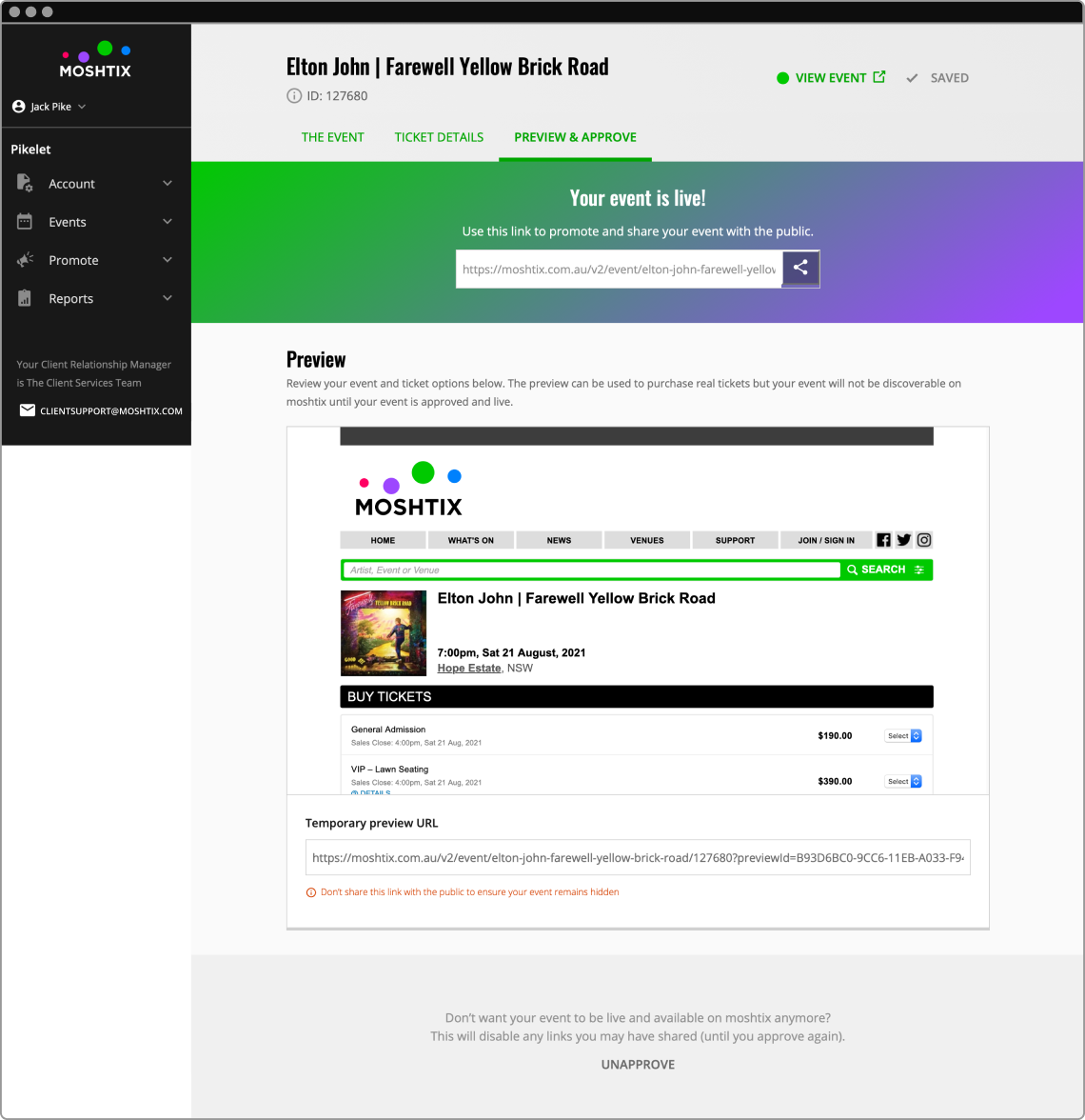
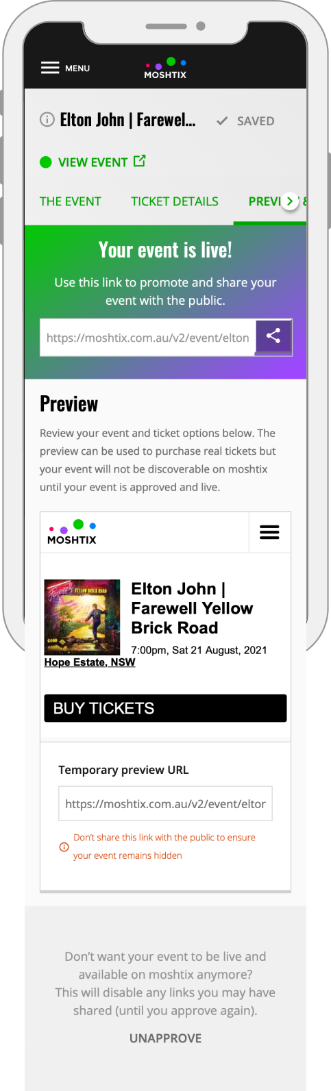
4. Event live
1. Event details with error state
2. Ticket details with advanced options

3. Preview and approve event
4. Event live
RESULTS & TAKEAWAYS
Since the implementation of the new build I have received great positive feedback from our clients and users about the simplified, streamlined event building process. Additionally, users are very happy to be able to update events on the fly on their mobile, which was an arduous task beforehand.
Key results from this project were:
It now enabled self-service event management for the first time at Moshtix. From registration, to building an event and putting in onsale to settling the money received from sales. This was not possible before.
It has assisted in winning new clients with the clear focus on user experience for venue owners, promoters and artists.
The key takeaways were:
A strategic plan was created for the rollout of the rest of the Moshtix Control Room. Given the extent of the research undertaken there was a clear path forward beyond the MVP release.
A design system was created to support future projects. Working with the UX designer we developed components, patterns and features that include common UI components such as navigation, buttons, search bars action confirmations and error states.